Salvaging and Repurposing Part III
by: Kim (Bo) Stone Kalil
In this article, I want to write about continuity in design as a foray into exploring this month’s featured salvaged and repurposed items.
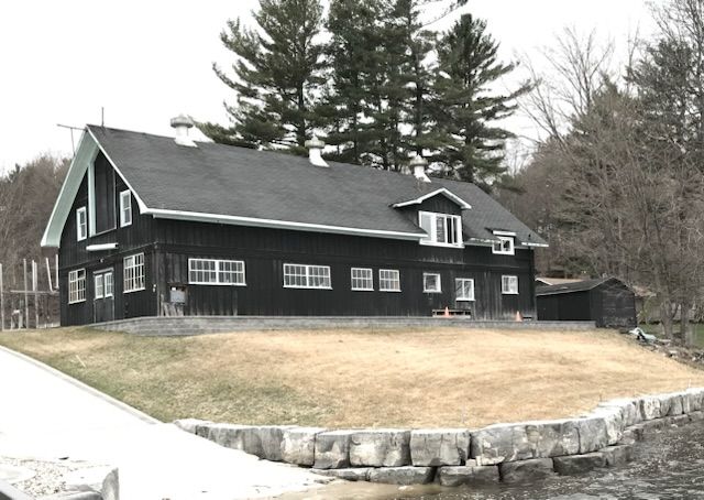
Continuity is critical in any design, as it provides a sense of cohesiveness. It can mean extreme consistency or repetition, but it can also be used as a way to ground variety and change throughout a design, for instance, by marrying several styles together seamlessly. This is a secret to successful eclectic design. Continuity is not necessarily noticeable when it works, but is certainly noticed when it doesn’t. Things that create and contribute to continuity are colour, line, pattern, scale, texture, materials, theme, or any combination of these.
In the horse stable conversion, the continuity element was predominantly colour palette, and secondly materials, which allowed me to mix contemporary pieces with rustic pieces. Since my daughter had been an equestrian for eight years, I knew quite well that everything to do with stables and horses was dusty and hazy, so I wanted my colour palette to reflect that. It was an intentional subtly in the design. Even the kitchen cabinet colour (Benjamin Moore Aegean Teal) is a smoky, muted aqua, not a vibrant one. In choosing paint colours for century homes and vintage buildings, I like to use Benjamin Moore’s Historical Palette because these colours usually have black in the paint formula, which prevents them from becoming too vivid under certain lighting conditions. The kitchen cabinet colour is repeated in the varying shades of the handmade ceramic tiles I chose for the fascia surrounding the fireplace in the great room, across and visible from the kitchen.
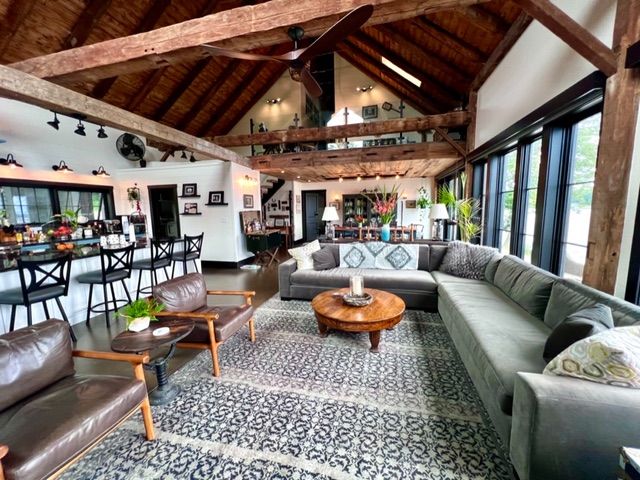
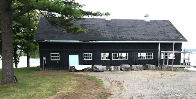
The barn was built in 1920, when Art Deco style was popular. One of the materials prominent in Art Deco design is black marble, not only with the typical white veining, but also a caramel veining. For the kitchen counters, instead of real marble, which can require frequent sealing and maintenance (yes, even black marble), I used a porcelain veneer that mimics this marble. The porcelain is as durable as marble but without the maintenance.
The marble look is repeated in a few decor accents in the great room and in the vessel sink in the powder room in the foyer. The caramel colour of the veining is in the same tone family as the original wood and log ceiling of the horse stable and many pieces of the furniture, both antique and new. The black, meanwhile, is carried throughout all the window and door trims, the light fixtures, the metal kitchen stools, in the area carpets and bookcases, and into the area that I'm going to focus on in this issue; where the newly built foyer connects to the original barn.
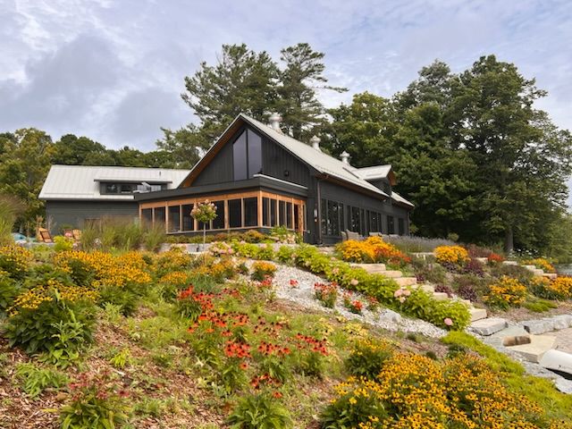
This foyer is an area that transitions people from the exterior, a gently sloping, grassy terrain with a grove of old pine trees and flagstone pathways, into the interior of the barn, the ground floor of which now houses the great room, dining room, kitchen, and primary bedroom. This space bridges the barn to a newly built structure, mainly housing on the ground floor, a garage with woodworking shop, the bathroom, and an apartment suite on the second floor. Being a bridge area, we wanted this space to have a feeling of lightness and exposure to the exterior landscape, and so its walls are primarily glass.
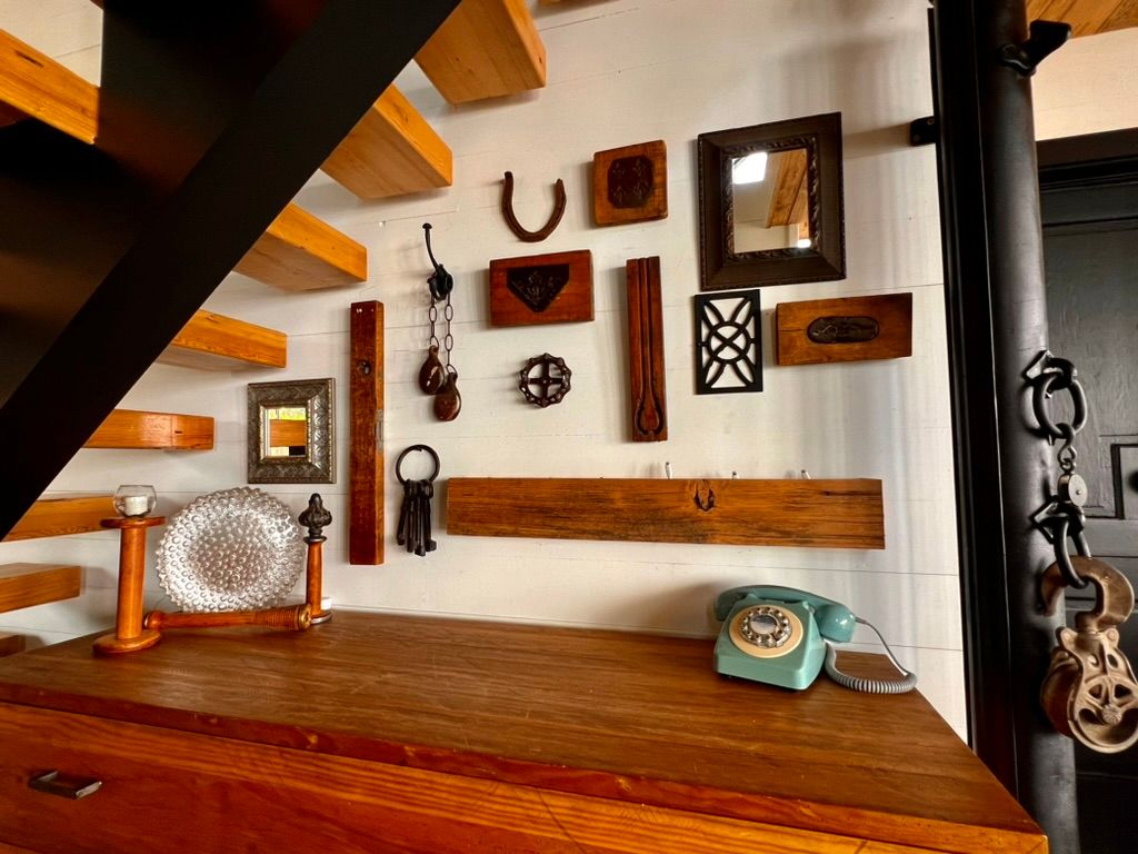
This space is also the origin point for an open-tread staircase leading up to the barn's second floor. And under this staircase was the perfect place to put a dresser made of salvaged wood and metal to create a charging station for cell phones, tablets, and laptops. My builder fashioned the actual charging station out of wood scraps left over from the dining room ceiling, which I wrote about in the last issue. This little shelf has six phone-charging cables fed through the wall and into the mechanical room behind it. This provides one place central for everything, but not in a gathering point, thus eliminating the visual clutter and distraction of phones being plugged in everywhere.
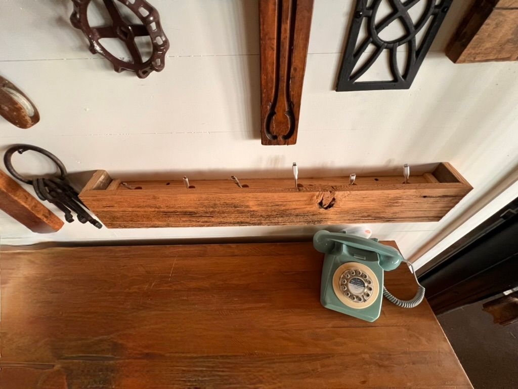
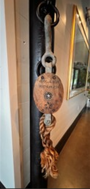
I decided that this would also be a great place for the display of a collection of items in a similar amber and black palette, so the charging shelf could disappear. Old pieces of ironwork, pulleys, moulds that were used to create plaster mirror and picture frame embellishments, a large old faucet handle, a horseshoe, a 1950s glass ceiling light fixture displayed on its side and lit with battery operated pin-lights, wooden spools (one used as candle holder), an antique doorknob, and a ring of wrought-iron keys. The latter two items provide continuity with the motif from the two filled glass lamp bases featured in the August issue.
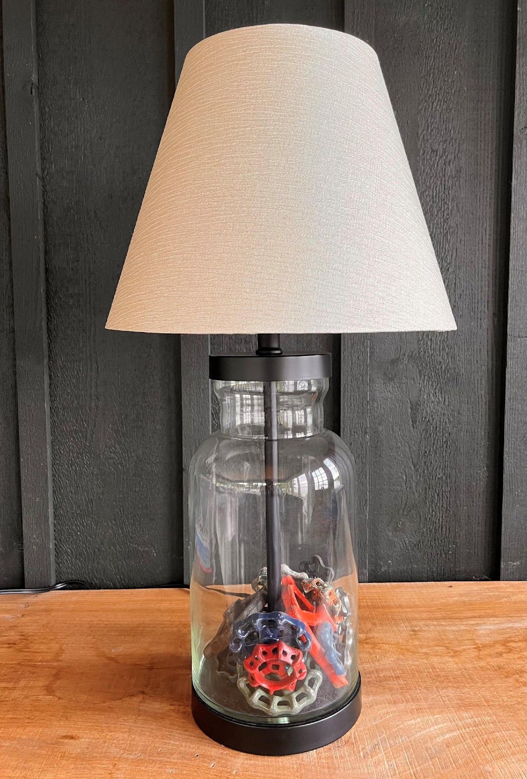
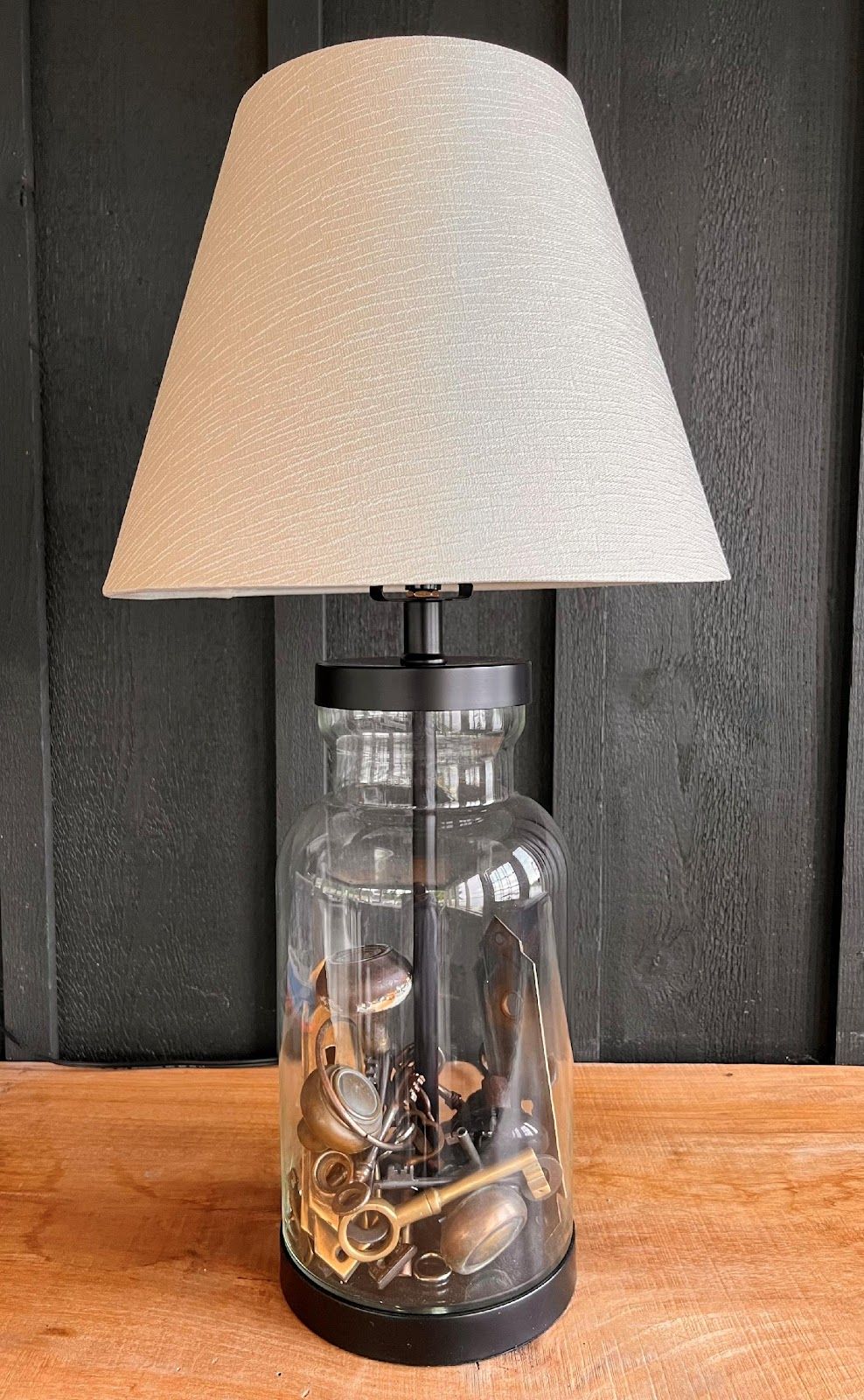
These technical and decorative elements make this otherwise fairly useless area nestled under the open tread staircase very functional. The treads of the staircase were salvaged from one of the barn’s original Douglas Fir support beams we had to remove to remodel the second floor and are supported by a contemporary style black metal centre-stair stringer support. The staircase is also in the amber and black palette, and because everything here is in the same colour palette, it doesn't feel as distractive as it would if all these items were in a wide array of colours.
The only item of colour here is a vintage landline phone; very close to one of the colours in the area rug of the vestibule as you make your way to this charging area and practically identical to the Aegean Teal of the kitchen cabinets and the fireplace surround tiles. Again, because it is a muted colour already existing in the vestibule and great room, it doesn't stand out, but blends in, and is a little hint of the colour you’ll see more extensively as you turn the corner into the great room and kitchen.
The space is both practical and visually interesting, the perfect spot to display a collection. Originally, the cross-tie poles lined the centre aisle of the stable in pairs the entire length of the barn, and were used to secure the horses safely for grooming, and as such would have been fastened to the floor and the ceiling. I salvaged two of these poles, had a welder shorten them, cap each with a decorative ball, and used them to flank the entry into the great room. I also used the rings to continue the display of antique pulleys by the charging station. This palette is also anchored visually by the 19th century yoke for draft animals displayed on the header wall spanning the vestibule, which is particularly observable to anyone descending the staircase from the mezzanine.
Conclusion:
So, there you have it – Salvaging and Repurposing, Part III of IV.
I hope that I have described my continuity in design in this the third of a series of four articles on Salvaging and Repurposing. By all means, let me know if you have a special item that you have salvaged and not sent to the landfill.
By Kim (Bo) Stone Kalil
Kim (nicknamed Bo in high school) Stone Kalil, lives in Toronto and spends as much time as possible with her family and friends at her home in the Thousand Islands, which was previously a 100-year-old defunct horse stable. Her design company is kskdesign.ca and she designed the home with the help of architectural designer Michael Preston out of Kingston, and had many design conversations with her son Matthew Kalil a Master of Architecture graduate of University of Toronto. The extensive renovation was done during 2020-2023 by the incredible Brian Wooding from Gananoque and his talented team. Bo is an avid traveller and photographer, and dabbles in acrylic painting. and as if that does not keep her busy enough, Bo is pursuing a degree in psychology part-time at York University in Toronto.
