Depth of Field: The Story Behind the Image “Winter Solitude”
by: Chris Murray
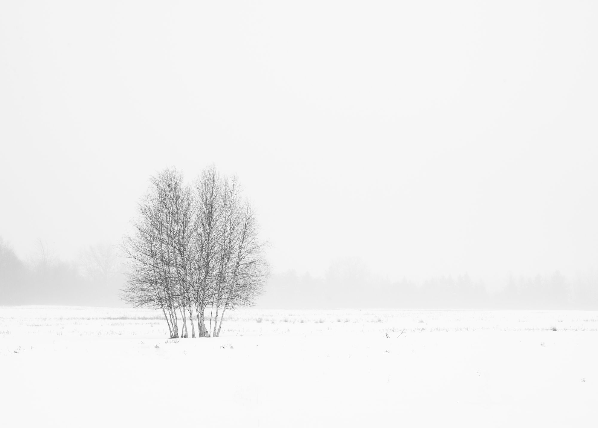
Not far outside the village of Clayton and adjacent to the Sissy Danforth Rivergate Trail, one can find stands of young birch trees scattered throughout farmers fields. I first discovered this area a few years ago, and I return often, especially in winter when the trees have been laid bare.
On this particular morning, a light fog blanketed the scene. From a technical standpoint, this was a simple photograph to capture. I somewhat overexposed the scene, to emphasize the bleakness and help hide the tree line in the background. In processing, I “burned” (darkened) the stand of birch trees slightly to add contrast. The decision to render the scene in black-and-white was mostly moot as there was little color to begin with, a condition not uncommon in winter.

I am drawn to simplicity in a photograph, and the use of negative space is a great way to accomplish that. Negative space refers to the area within the frame that surrounds the area of interest, what is often referred to as positive space. Negative space is usually (but not always) relatively devoid of detail, thus giving the viewer’s eye a place to rest in the photo and helping draw attention to and emphasize the primary subject in the image, in this case the stand of birch trees. In short, the use of negative space provides “balance” in the photo by countering the greater visual weight of the subject of interest.
The inclusion of negative space in this photo was also done to help tell a story. Looking at this lone stand of trees in a foggy and snow covered field I was struck with a feeling of desolation and solitude. Including the extra space of white around the trees helps to create this sense of isolation and loneliness, something we often feel in wintertime. The trees are the main subject in the photo, but if I had zoomed-in on them more tightly, the image would not have the same feel and emotional impact. The negative space highlights the trees isolation. This photo is a good example of how visual elements can be used to communicate more than just what something looked like, but also to evoke a desired emotional response in the viewer.
By Chris Murray
Chris Murray is a full-time photographer, instructor, and writer. His work has appeared in several magazines, including Popular Photography, Shutterbug, Adirondack Life, Life in the Finger Lakes, and New York State Conservationist, among others. Chris teaches classes at the Thousand Islands Arts Center in Clayton and at Jefferson Community College. He is a staff instructor with the Adirondack Photography Institute. API’s 2019 workshop schedule is now available at www.adkpi.org. To see all of Chris' Depth of Field TI Life articles see here and for more of Chris’ work visit www.chrismurrayphotography.com.


